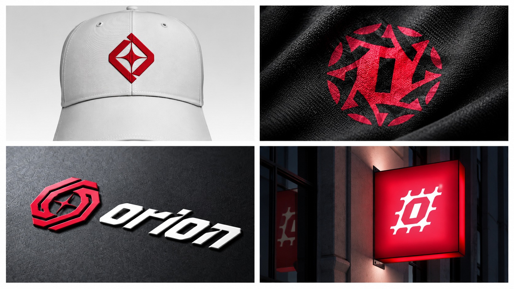
Developed for Northern Fitness’s proprietary equipment label, Orion explores the meeting point of celestial symbolism and physical strength. Four distinct icon directions were developed and tested through wordmark lockups, apparel and signage mockups.
Scope — Identity exploration · Icon development · Art direction · Application mockups

Opposing forms frame a central star. The balanced construction expresses force and resistance, giving the direction a sense of stability and guidance.
Repeated forms create a circular rhythm around a central axis. The direction draws on orbital movement to suggest energy, continuity and unity.
Angular geometry surrounds a central star, combining a celestial reference with a technical character. Interlocking forms give the mark a sense of controlled movement.
A reinforced, grid-inspired silhouette introduces an industrial direction. Its structure connects directly to the strength and durability associated with training equipment.
Selected applications test the icons across embroidery, fabric printing, dimensional branding and illuminated signage. Each setting reveals a different requirement for scale, contrast and recognition.
Identity exploration and application concepts · Last Letter Studios · 2026.