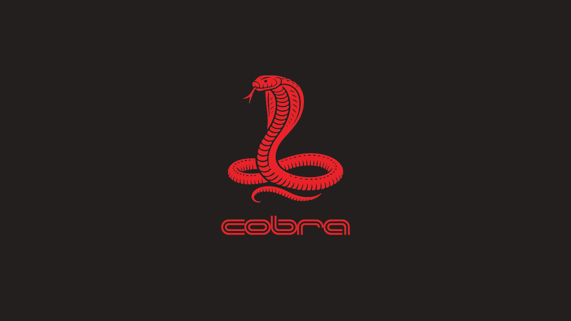
C.O.B.R.A supports professional athletes across lifestyle and performance management. Working with the founder, the project established a more coherent visual direction—one that could move between discreet professional service and a confident cultural presence.
Scope — Brand repositioning · Visual identity · Typography · Colour system · Application concepts
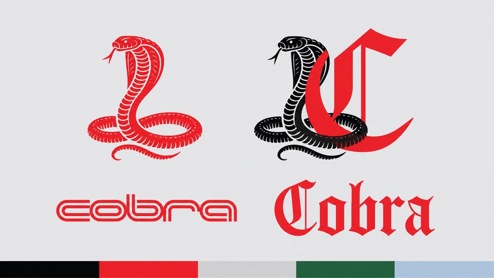
The snake emblem and gothic monogram give the identity a recognisable silhouette. A streamlined wordmark adds a contrasting register, supported by neutral typography for everyday communication. Red anchors the system against black and cool grey.
The monogram becomes the focal point of the business card, while a restrained pattern adds depth. Clear hierarchy keeps the practical information legible without competing with the identity.

Apparel explores the more expressive side of the brand. Stacked gothic typography turns the name into a graphic composition, carrying the identity into a lifestyle context.

Small object applications test how the typography, colour and emblem work together at close range. The treatment remains recognisable even when the available surface changes.

Selected design explorations and application mockups.