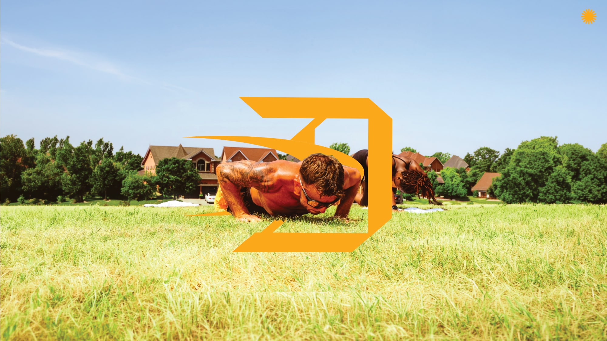
Founded by professional athlete Alonzo Addae, Daely grew from a fitness initiative into a broader philosophy of care for mind, body and soul. The refresh translates that evolution into a visual system grounded in consistency, movement and personal growth.
Scope — Brand direction · Identity exploration · Typography · Iconography · Application concepts
An angular motion mark, a softer lowercase identity and a sweeping sport emblem give Daely different ways to express the same outlook. Sun motifs introduce warmth, while the yellow-and-black foundation holds the system together.

The sunburst becomes a repeatable pattern. Its rhythm gives a simple symbol enough presence to cover larger surfaces while keeping the brand recognisable.

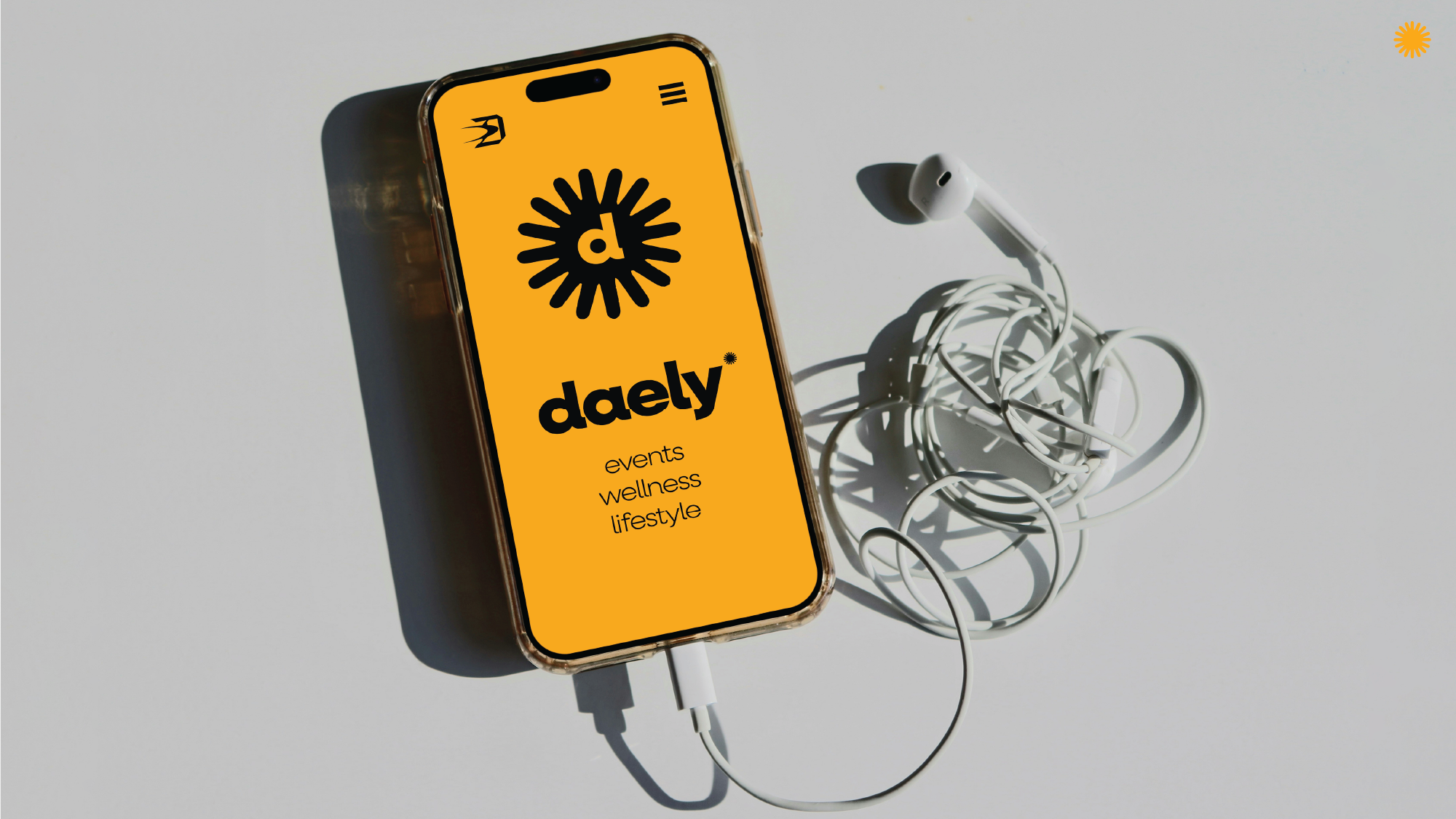
The mobile concept brings the wordmark and sunburst into a focused composition. Bold colour and uncomplicated hierarchy keep the identity direct at a small scale.
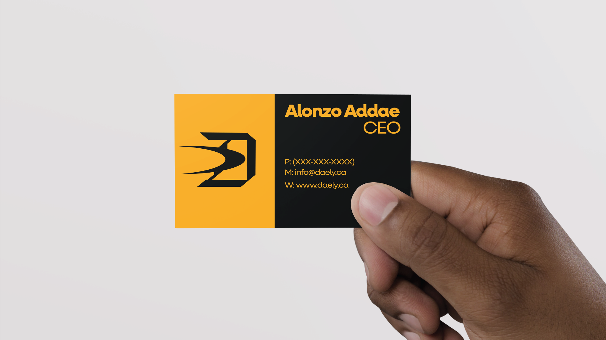
The business card pairs the primary mark with concise information. The same balance of energy and restraint carries from digital presentation into a physical touchpoint.
Selected design explorations and application mockups.