Glorious brings training, community and personal discipline into a shared brand world. The work connects identity, product and campaign direction through a visual language shaped by intensity, texture and commitment.
Scope — Art direction · Brand identity · Product concepts · Apparel · Campaign direction
The arched blackletter wordmark gives Glorious a forceful, recognisable centre. Clear supporting typography balances its character, while neutral tones leave room for selective colour and strong photographic contrast.
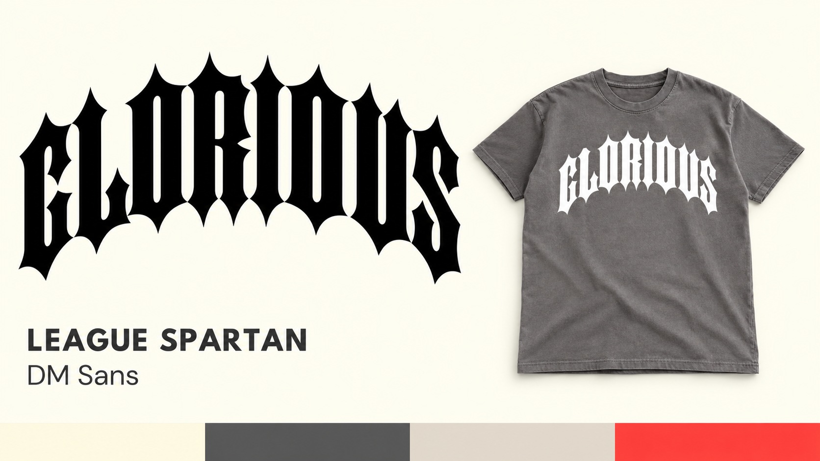
Scale creates the hierarchy across apparel: a quiet chest mark, a larger back graphic and supporting placements on sweats. The limited palette keeps the collection cohesive while texture gives the lettering a physical presence.
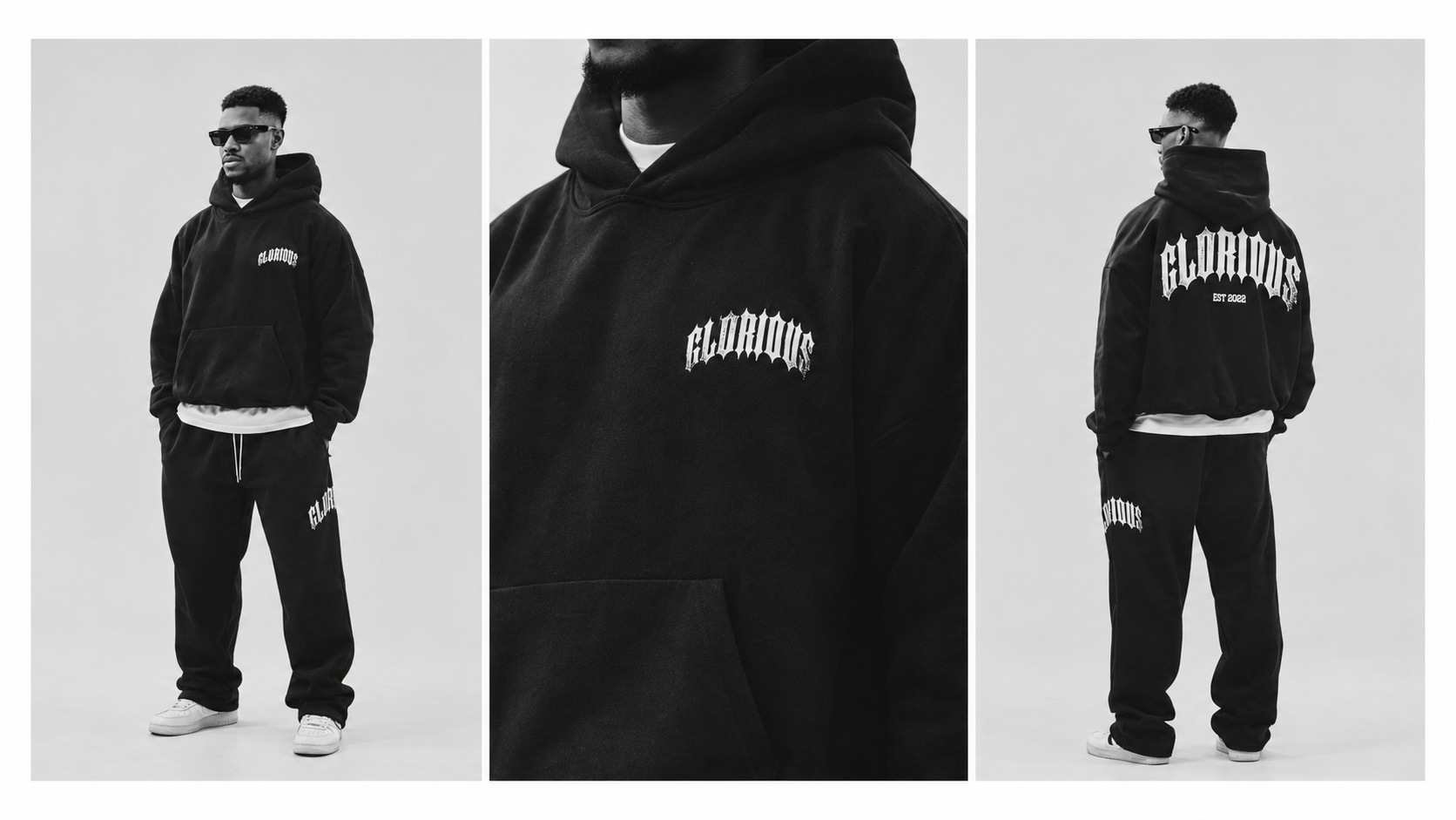
The art direction centres on movement, candid intensity and the training environment. Close details and full silhouettes give the product context, connecting the graphic identity to the people who wear it.
Selected identity work and apparel presentation imagery.