Northern Fitness commissioned Last Letter Studios to explore the identity for its Orion equipment line, design a Mercedes-Benz Sprinter wrap, and develop a collection of apparel graphics. The goal was to extend the brand across product, the street, and everyday wear with a distinct visual approach for each application.
Brand identity exploration / Vehicle wrap design / Apparel graphics
Last Letter Studios · 2026
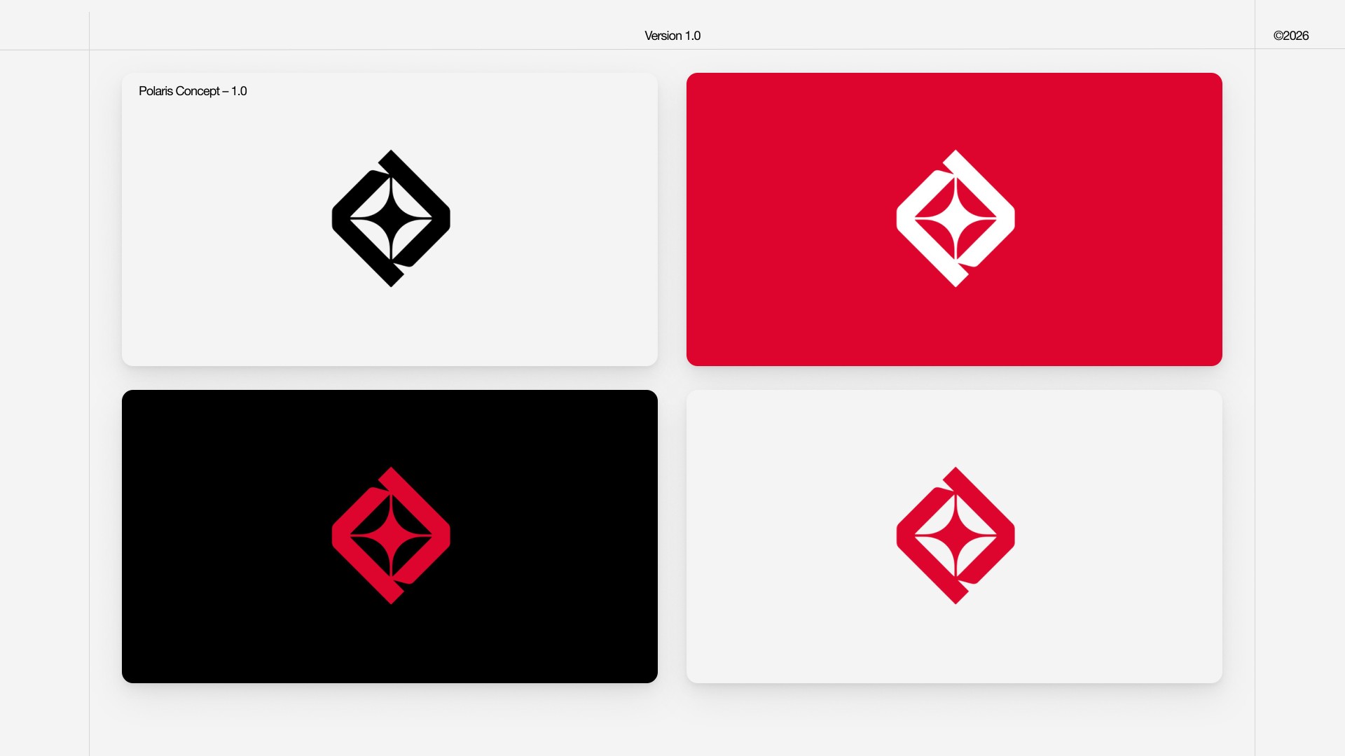
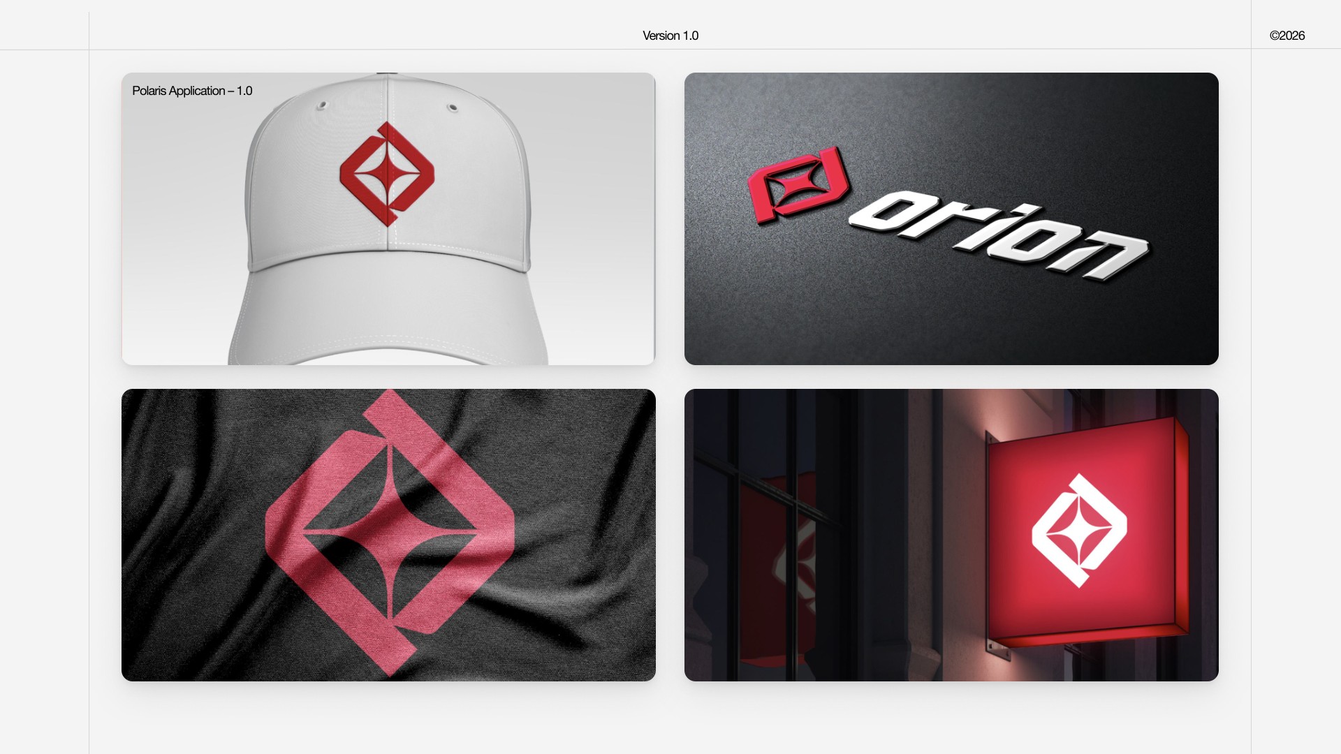
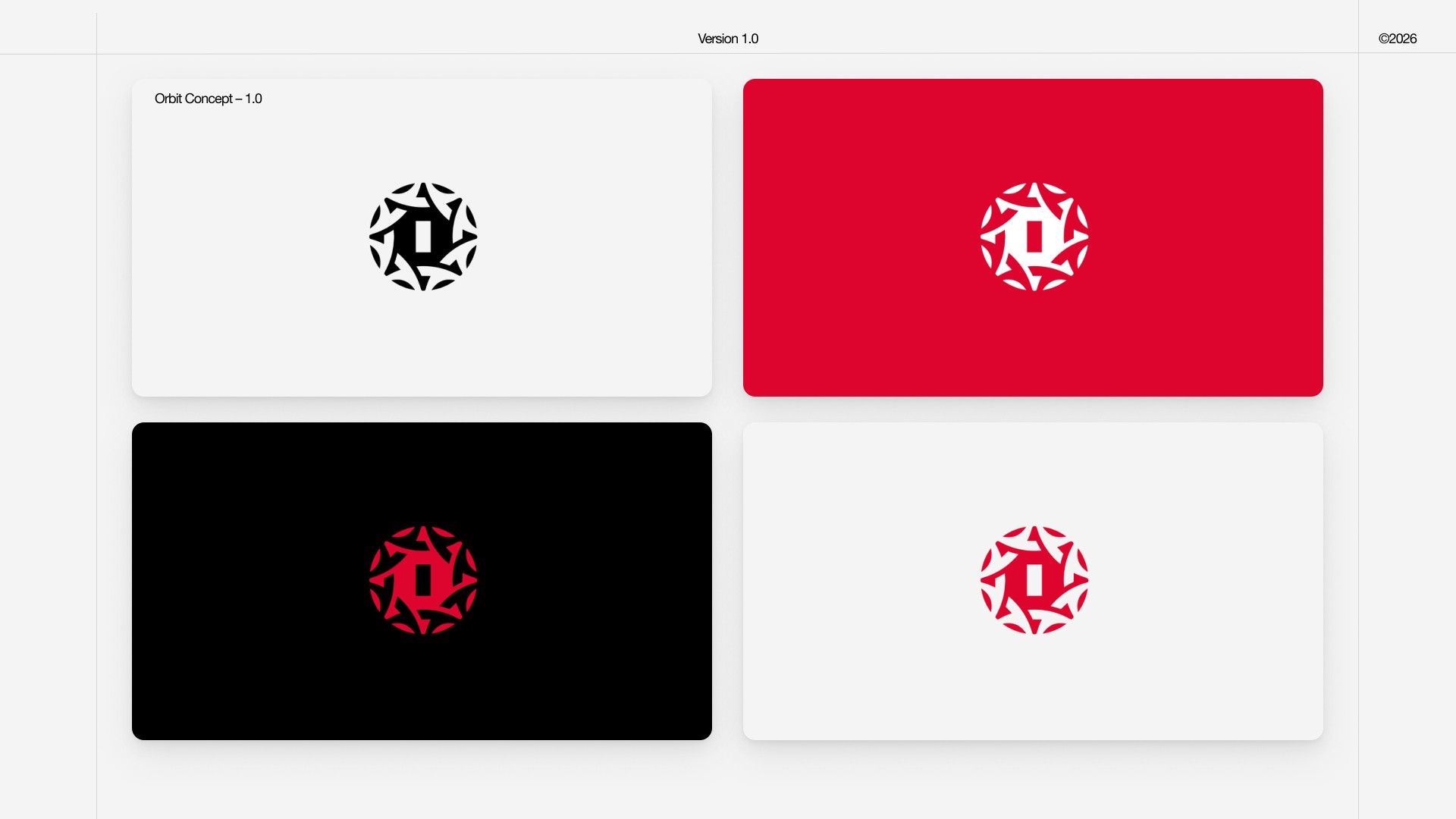
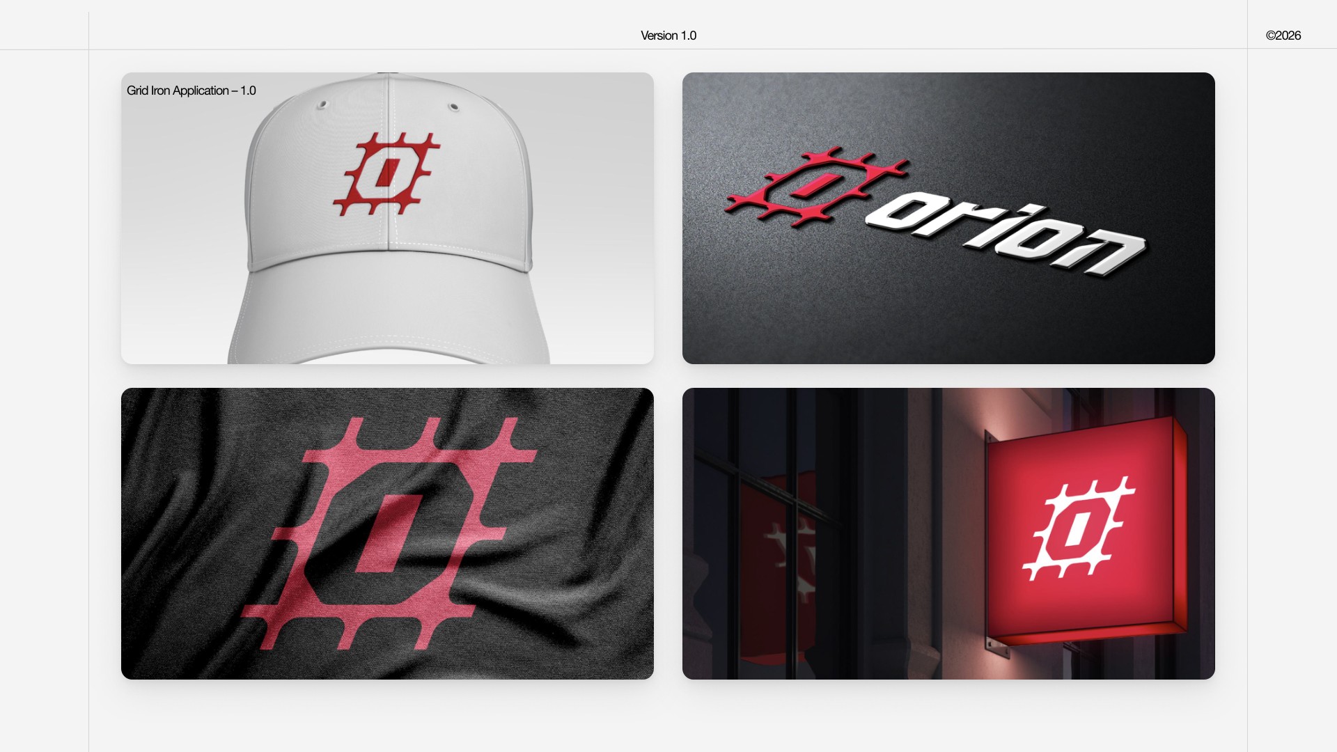
Four icon concepts explore different expressions of strength and performance. Each direction is shown through colour variations and application mockups, testing how the mark works alongside the Orion wordmark and across physical surfaces.
Force, resistance, stillness, and magnetism. A balanced symbol built around a central star, exploring the tension between opposing forms.
Energy, motion, unity, and harmony. A circular composition that brings a sense of movement to the Orion identity.

Performance, sport, guidance, and direction. An angular icon that gives the identity a technical, focused character.
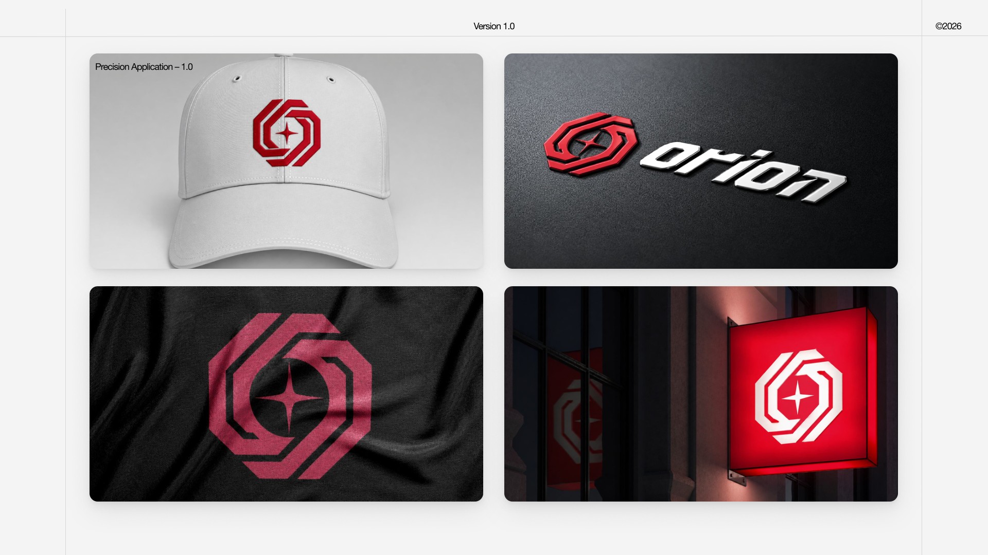
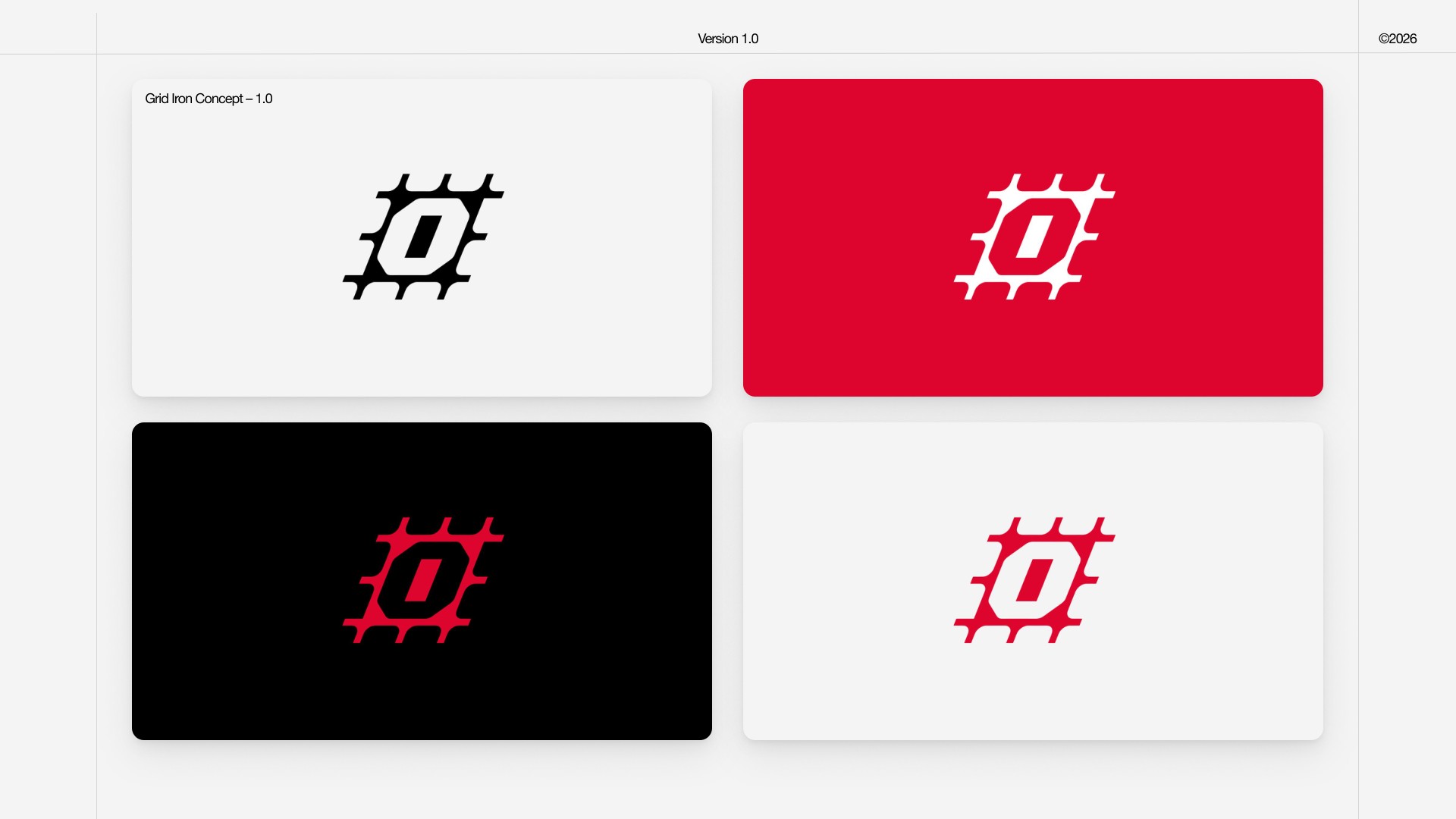
Strong, built, and tough. A structured mark that expresses durability through a bold, grid-inspired form.
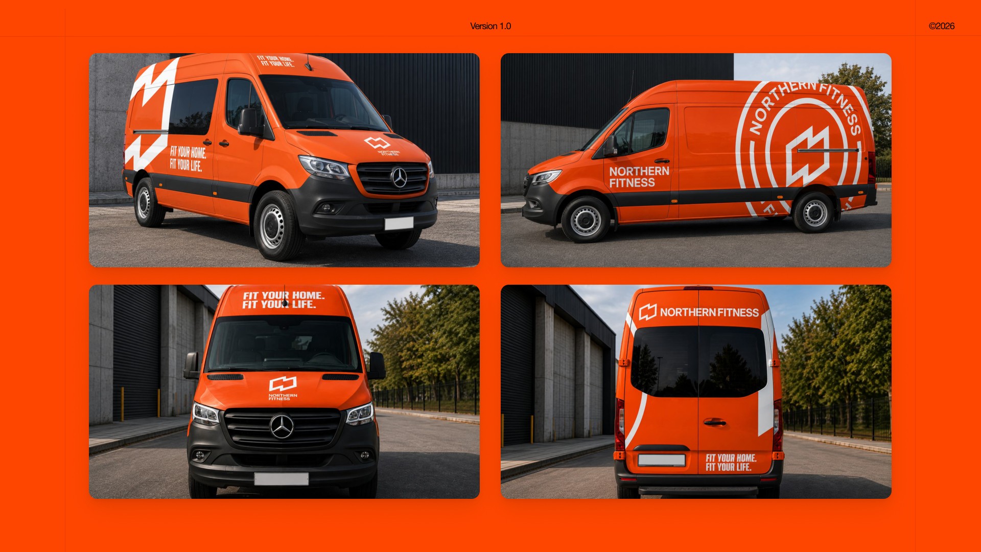
The Sprinter wrap turns a service vehicle into a bold extension of the Northern Fitness brand. High-impact orange, oversized brand elements, and strong typography create recognition at a distance and in motion.
Expressive graphics are balanced with negative space to keep the design clear across the vehicle's body panels. The result is a moving brand presence built around the message: “Fit Your Home. Fit Your Life.”
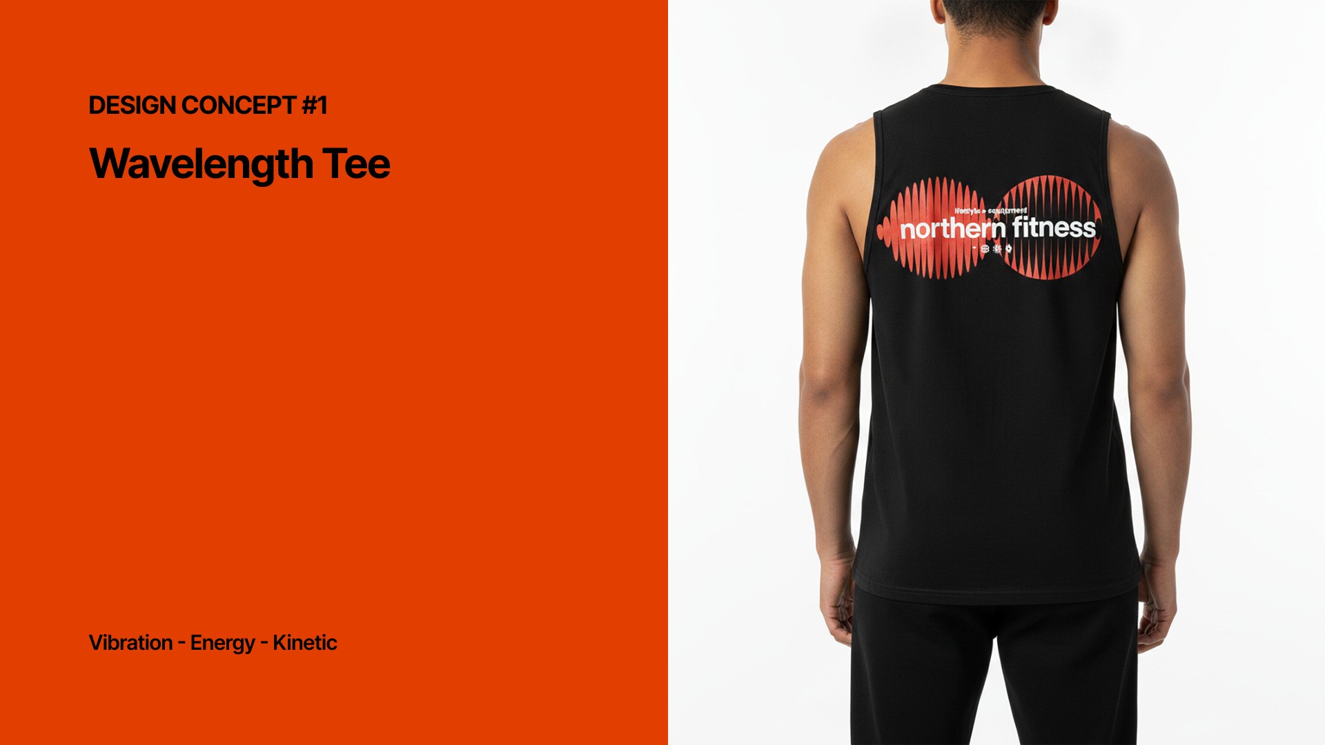
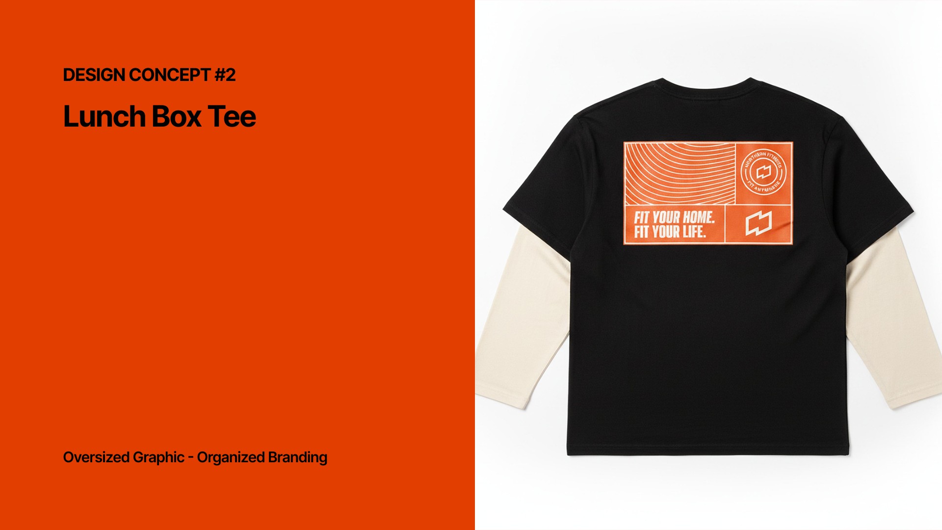
Three apparel concepts translate Northern Fitness into graphic-led pieces, exploring energy, oversized branding, and community.
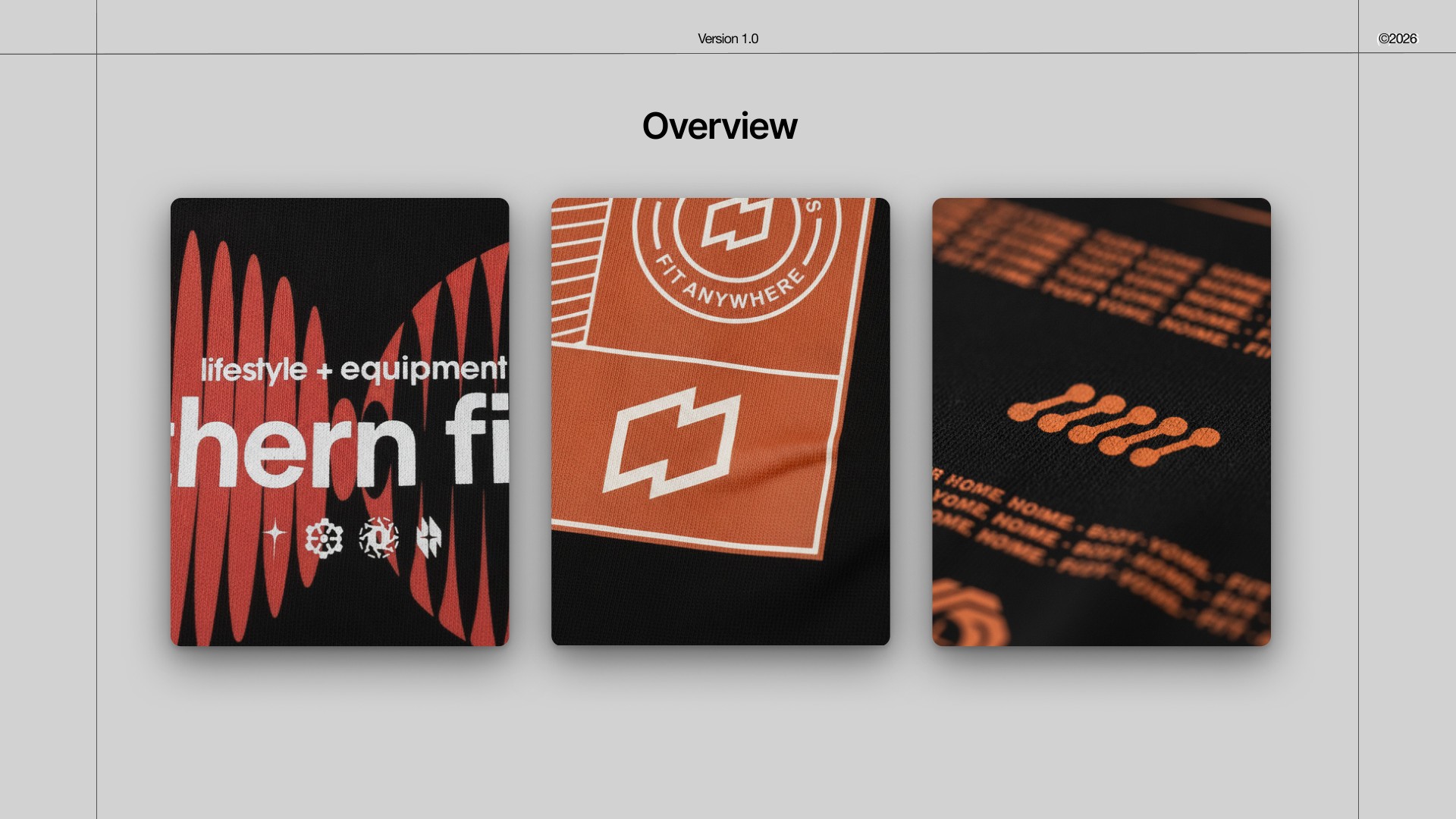
Vibration, energy, and kinetic movement expressed through a flowing graphic treatment.
An oversized graphic with an organized arrangement of Northern Fitness branding.
A community-focused direction that brings the brand together in a club-inspired graphic.

Selected concepts and mockups from the September 2026 exploration.