
Embassy Custom Cleaners is a family-run business in Mississauga. The refresh gives its everyday service a distinctive visual identity, balancing a cleaner presentation with the warmth and familiarity of a neighbourhood shop.
Scope — Visual identity · Typography · Illustration direction · Brand applications
A hanger becomes the frame for the script wordmark, connecting the name directly to the service. The circular seal adds a compact format for smaller applications. Inter brings clarity to practical information; Courier Prime introduces a familiar, heritage character.
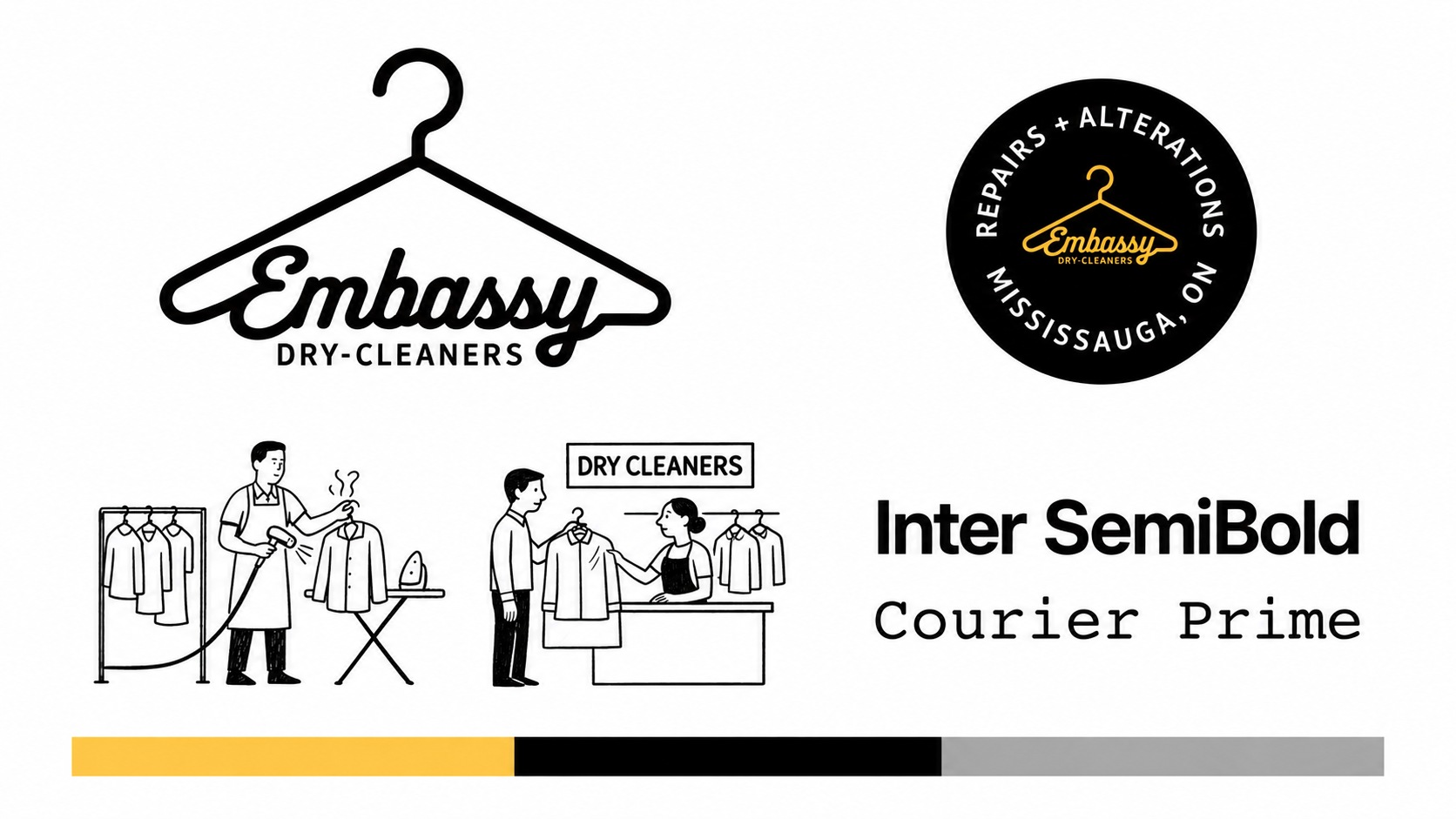
Yellow provides a welcoming point of recognition. Paired with black and quiet neutrals, it carries consistently from the identity into printed materials.

The vehicle application tests the identity at a larger scale. A clear logo, a single colour field and restrained supporting information keep the brand easy to read in passing.

Shop illustrations bring the people and care behind the service into the identity. Applied to a reusable tote, they turn a routine collection into a small expression of the business.

Selected design explorations and application mockups.